Create your first Facebook ad

This is section 5 of Facebook's Getting Started With Ads guide, which focuses on a few points that should be noted in your ad content.
| Ad performance and ad content
Your Facebook ad images and ad essays determine whether your campaign will succeed.
Using different ad types, the difference between CPC per CLICK and CPC per conversion may be 100% or higher.
The study found that images accounted for 75%-90% of advertising performance. Therefore, we must do a good job of advertising content, in order to really play a role.
| How do I set up Facebook ad content?
During the ad production phase, you can choose from several types of ads, depending on your campaign goals.
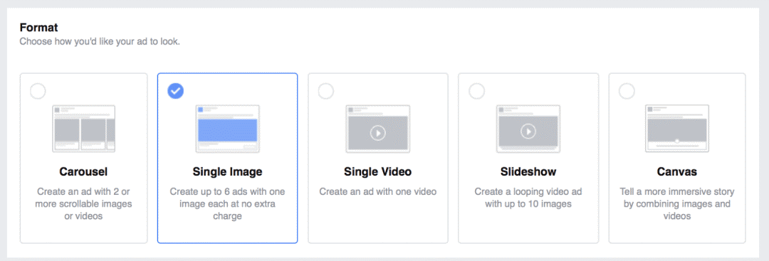
Facebook allows you to test six different image ads at the same time to find the best-performing options. We recommend that you constantly test some ad elements, starting with ad design.

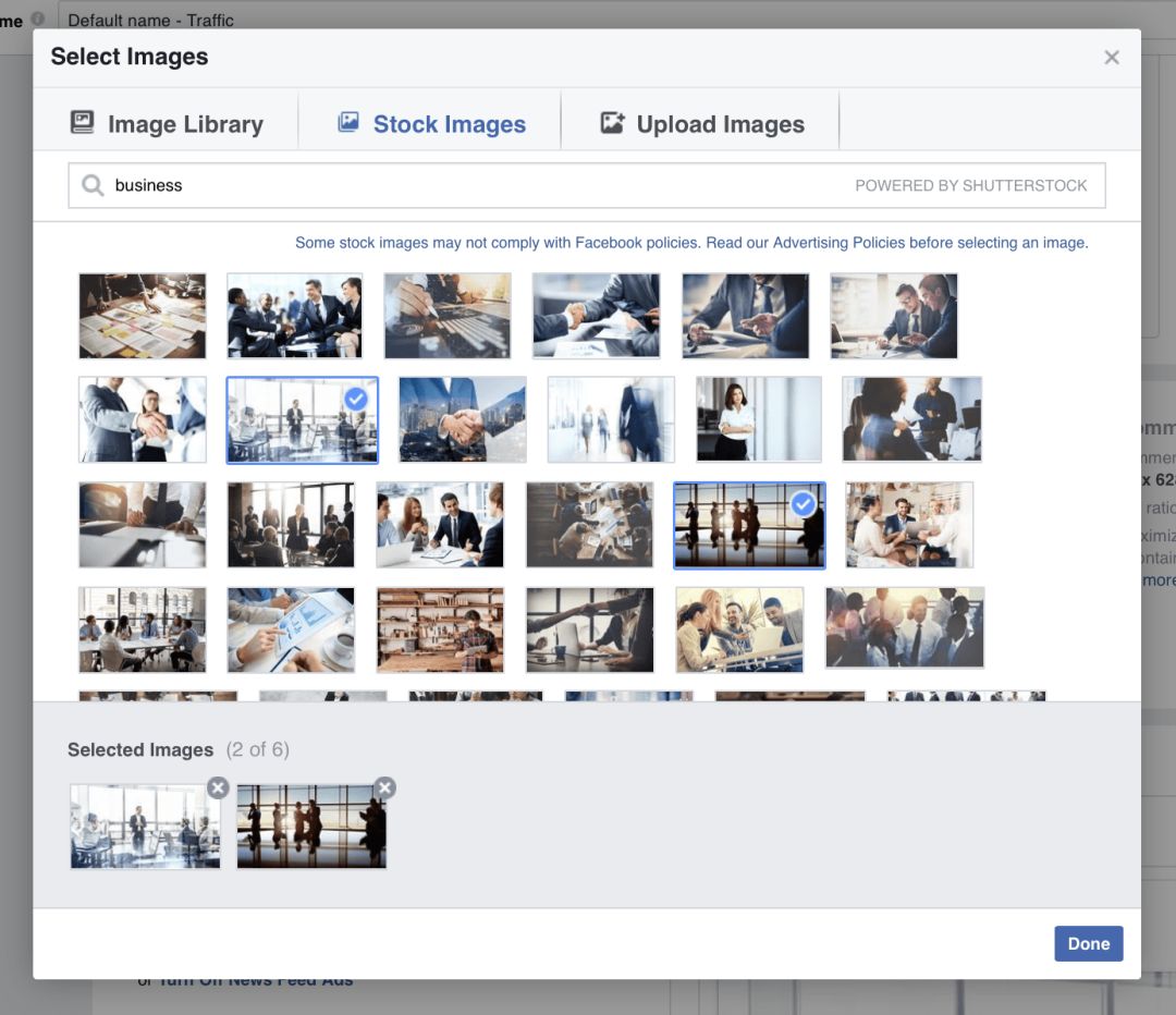
There are three ways to select an ad image:
Upload images locally from your computer
Browse your library to reuse images you uploaded earlier
Find images in the free image database
You need to update your ad images frequently to eliminate visual fatigue and keep your ads fresh and attractive. In Facebook's image database, it's useful to find and use new images for free at any time, and save a lot of money.
Keep in mind, however, that all Facebook advertisers can use these free images, which means that most images are used for thousands of campaigns.
| Facebook ad design best practices
In order to maximize the value of your advertising costs, can bring better click-through rate, from our better performance of Facebook ads, we summarize a few points for your reference.
To create a beautiful Facebook ad design:
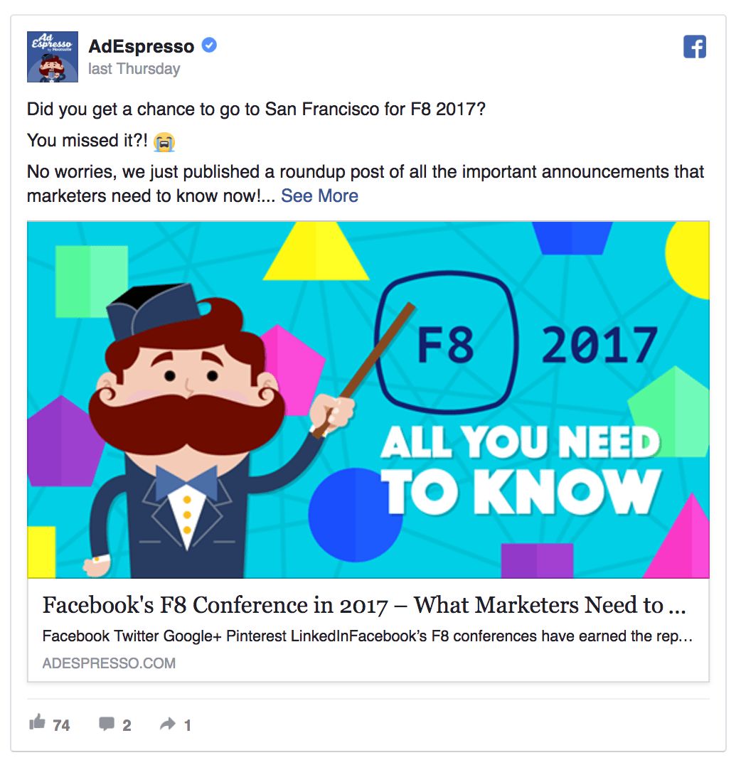
Make your ads colorful to get people's attention
Put your value proposition in the ad map so that it can be communicated to the person who is looking at the ad
Create ads that contrast sharply with Feed Stream
Use the correct picture size (1200 x 628 pixels) to make sure your creatives look good on every screen
| Advertising paper
Advertising pictures are the first important element, advertising paper is the second important element. Advertising paper is about engaging users and then persuading them to take action, such as buying.
Facebook ads have multiple fields, and here are the number of characters you can put:
Main ad text: Up to 90 characters
Ad title: Up to 25 characters
Link description: Up to 90 characters
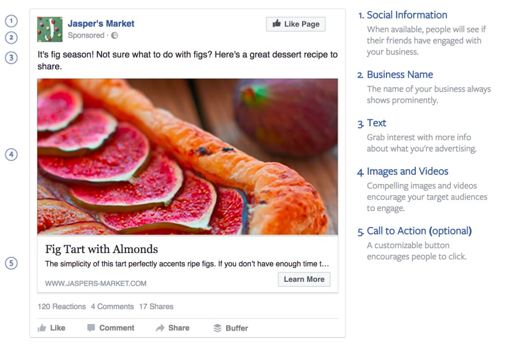
Before you create an ad, it's a good idea to prepare several different titles and descriptions. This way you can choose directly, rather than thinking about a new document while creating an ad.
Streaming ads have more options than classic right-hand ads. First, you can choose the Call to Action button provided by Facebook. The data prove that this button is very effective in increasing click-through rate. If they are suitable for your product, they are highly recommended.
Please note that the ad text should be short and clear.
The goal of the ad is not to sell, but to persuade people to click on the ad to find out more. Try to engage people and clearly state why you should click on your ad. Discounts and freebies are often helpful. However, be careful not to attract too many cheap clicks that don't help with conversions.
| How to set up an ad document
Set up.Ad documents are simple, just type in the corresponding blank box.
You can also preview your campaign. If you're testing multiple ad images or want to see how your ads appear on different screens (PC and mobile), you can choose a different preview.
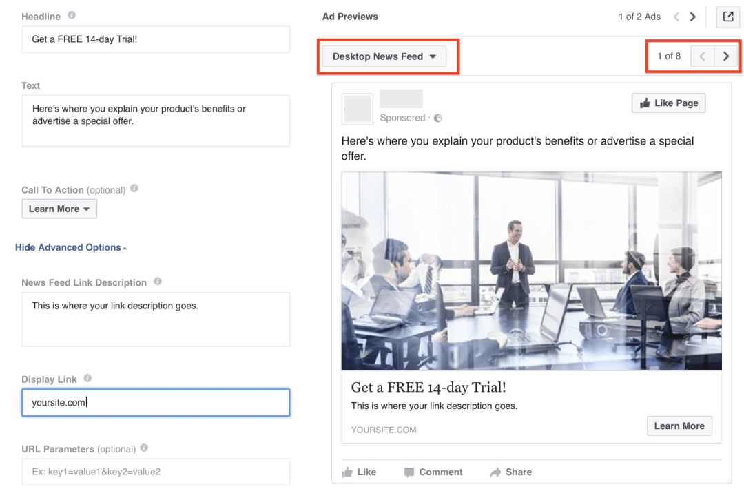
There are three ads supported by the display: the information flow (mobile and PC side), the right side of the column ads.
Many people think right-hand ads are a waste of money because they don't work as well as streaming ads. However, right-hand ads are relatively cheap, and if you're not tested, you'll never know which ad type is best for your campaign. So, test it anyway.
Also keep in mind mobile positioning. Some people run mobile and PC streaming ads at the same time, while the target site is not optimized for mobile customers, resulting in a very bad user experience. Mobile ads are only available when the site is suitable for mobile, otherwise you'll waste a lot of money because mobile users will generate a lot of clicks.
Removing a location is also easy. When you create an ad, you can preview how your ad will look in the three available locations with three options. At the end of each display label, there is a Delete button. Click it to disable the location.
Well, now that you've created your first Facebook ad, in the next section, we'll explore different types of Facebook audiences to let you know what targeting options are available.
For more tips on ad design and ad documents, we'll update this guide before adding it.
In addition, our Facebook marketing master training camp has begun to register, August 25-26, Shenzhen Longhua, tuition 3800 yuan,15 days ago to register a reduction of 800 yuan, interested can beSweep the codeOr.Read the original textCheck in


Go to "Discovery" - "Take a look" browse "Friends are watching"