The successful Facebook ad is like this

Facebook ads, not only are visually appealing, products are usually of interest to consumers, so they work very well. Here are four successful Facebook ad stories from which sellers can learn from their experiences and make their ads more compelling.
Facebook Ad Case 1: Cloud House (Slack)
The company's Facebook ads are very attractive.

It is well known that people hate to have complicated and meaningless meetings. So, simple and efficient - visually telling people what it's like to have a 25% reduction in meetings - is a compelling place to point out the conveniences of Cloud House as an enterprise communications platform.
In addition, the advertising style is playful, through the network language and images, so that the product appears more real and reliable.
Sellers can learn from:
Focus on how users or consumers feel after using your product
Advertising ideas/images are imaginative
Consider whether using simple, clear slogans in your ads (for example, "Make your job easier") is appropriate for your personal product
Facebook Ad Case 2: Google
Google is so well versed in online advertising that it can't help but design stunning ads.

There are many wonderful things about this advertisement. First of all, the Google icon "G" is seamless in advertising, while quoting to enhance the quality of the brand's services.
Second, advertising cleverly combines concise active verbs with motivational discourse to create a sense of excitement about using a "cloud computing platform". Google could have highlighted any of the features of a "cloud computing platform", such as speed or security, but chose "Building What's Next" as a gimmick to make ads more attractive and to guide potential customers to imagine what they could do with the platform - the first step in their success.
Third, the color matching used in advertising is also worth mentioning. The vivid light blue not only matchs the dark blue of the Facebook page itself, but also conveys the trust and firmness that the color itself represents (which is why many big tech icons use blue).
Sellers can learn from:
Use active words as much as possible in your advertising language
Try simple dark colors as the main tone
Provide financial incentives
Facebook Ad Case 3 :D The Rollar Shave Club
The men's beauty industry is a multi-billion dollar industry (with an estimated $21 billion in deals this year), and competition among companies selling men's beauty products is intensifying. The Dolar Shave Club, on the other hand, stands out from the growing market.
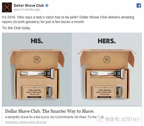
The ad is so clever that instead of emphasizing gender as other razor companies, it's pushing the product to a whole new consumer base, women.
The ad begins with a joke that distinguishes the Dolar Shave Club from other beauty companies, and the "pink" scraper both activates the atmosphere and points to the target consumer groups of TheOllar Shave Club products.
Without the need to produce new products, existing product lines can be extended to a large new consumer base. At the same time, Dolar Shave Club is a forward-looking and enterprising company that keeps pace with changing social values. The ad is a great example of how sellers promote brands and push best-selling products to new consumer groups.
Sellers can learn from:
Brand values can be a big selling point.
Review goal setting and key audiences to see if existing product lines can be extended to new consumer groups?
See existing buyers - do they really represent your ideal customer, or do you inadvertently overlook potentially valuable customers?
Facebook Ad Case 4: Shopify
Shopify's ads, which were posted on Facebook in April, are compelling and sharply reveal the core customer base and target market for the business.
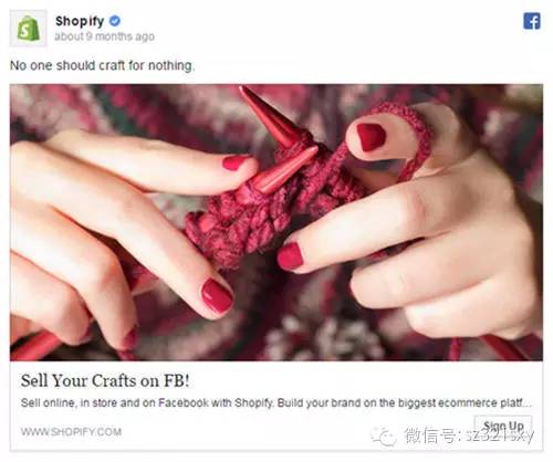
Shopify understands that many potential customers make handicrafts for their own personal interests, but they don't want to sell or open their own online stores. But that's why Shopify is so appealing.
Encouraging words and messages are the subject of Shopify's ads on Facebook. Here's the picture:

Sellers can learn from:
Use encouraging language to inspire hope and ambition - how can your product or service help them become what they like?
Ask questions from the customer's point of view
Think about what style you want your ads to look like - clean and simple? Colorful and vibrant?
Content comes from Hugo.com, don't blame the small editor lazy, really see good content can't help but share with you.



Go to "Discovery" - "Take a look" browse "Friends are watching"