Must-learn optimization tips: How to improve the conversion rate of Facebook creatives?

Share today the creative creations and some tricks for Facebook ad footage. Although Facebook ads are now highly respected for video footage, but the threshold of video footage is relatively high, whether it is creative planning or video production, there are thresholds, on the contrary, the creative or relatively simple image material, for a single small seller and running personal Offer's small partners, or relatively easy to achieve. In fact, the creative creative creative advertising image materials, are traceable, but also full of the way, today, let's talk about ha.
1. According to psychological research, consumers' color preferences, the favorite is blue, the following is the male favorite color ranking, women have a slight difference, that is, orange and yellow drop. And is with age, the more to maintain the trend of this table below, blue sky is everyone's love ah , then consumers like, to use this color? The answer is that this is not the case, even for designers,You also have to tone the scene, not cast it.

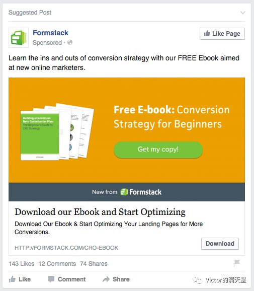
2. So, let's take a look at what is the direct KPI that measures the quality of our creatives? Yes, it's click-through rate. That is, if your picture design looks comfortable, but in the tumultuous information is also very humble, consumers brush past, did not pay attention to, then your material is a failure. Therefore, you have to let the consumer basically comfortable situation, attract attention to attract the consumer stop, which is the premise of interest and click. The charm of the novel is that it is reasonable and unexpected. Reasonable is easy to see, smooth, not sudden, unexpected is the contrast of beauty. The reason is subtle, immersive, but unexpectedly really relish the talk. So, in reality, the first step you have to do is to let consumers have a contrast, in order to attract attention, notice after feeling good-looking, with their own related, have a sense of design and like, before clicking. What kind of contrast works? The first is to take out what you can't say you mean, see the image under Mildlypennis on Reddit and some of the click-through content. This is now used on Facebook need to be careful, one will block the account, two inaccurate clicks are not conducive to further conversions. Second, can cause the contrast is the color: the first push is a large number of color blocks, a single image advertising 1200 x 628 pixels, if his background using a single color block to render, well used, enough to attract the attention of consumers, thereby reducing the possibility of the target user ignored.A lot of great ads are backgrounds for picture footage that use a single block of color or two blocks of color, easy to attract attention, the first step has been achieved!

3. Colors have thousands of kinds, what kind of color is suitable to do the background color of the picture, large blocks of color?Excluding advertising mainly highlights the factors of brand colorWe can take a good look at Facebook's UI colors, basically black and white with blue icons, tabs and corners. The information background on the information flow is white, which means that everything with white or close to the white color block to attract consumers, can basically be said to be a failure, if you choose these colors to do the background, unless your picture elements are very creative, or there have been people, otherwise it is really difficult to succeed. On the contrary, if the contrast is caused,Black.The solid color block background is definitely a good choice. Then again, the complementary colors of blue and blue on the UI are yellow, that is, blue is the most yellow,Yellow.As a creative background, as long as the element creative do a good job, orientation is no problem, click-through rate will generally not be bad.At the same time, yellow and black, but also in addition to white, the most lined color, that is, the text on your picture, logo recognition will be higher.If you don't want other colors, it's best to choose nearYellow, red color to do the background or warm color is bestThis is also the best way to make up for the visual lack of eye-catching image elements.

4. Have a small partner will say, if the picture element is already large picture material, a picture material is a relatively dim color of the creative, worried that consumers will ignore the idea, so brush it over? The answer is yesUse semi-transparent blocks of colorWith a paper, take a look at Trip.com's ideas: If you use this diagram directly, and add the main paper and CTA, it's clear that the visual impact is not now in the middle with a translucent gray block, which makes the texture of the picture stand out. From the design point of view, between the text and the picture there is no translucent color block excessive, but also lack of beauty, appear vulgar.

5. Look at the creative elements of the picture, if your product is already very creative, fashionable products, and color is more eye-catching, then congratulations, you only need to take note of the shooting time, it is likely to be directly used as material will produce good results. Pay attention to the shooting skills, the most want to highlight the point in the upper right part of the picture, the most eye-catching. If your product itself is not too creative in appearance, but more functional, it is recommended to use video or carnation, if you really can not use video to show,Create familiar scene ideas to appeal to users based on the characteristics of their audience.One of the more classic ideas in Facebook's official tutorial is a company that does headphones, and data analysis shows that many users of the product use headphones in running scenes. So their big picture idea is to run pedestrians and wear headphone elements, successfully attracted the attention of the target user, to achieve high click and conversion purposes. In this case, the direction of creativity is to create ideas for their relevant scenes based on the interests of the audience. One is to make it easier for these audiences to notice you, and the other is to make this part of the user feel privately customized if they are customized at the same time, and the sense of superiority (vanity) is also one of the factors that motivates the order.
Write more hasty, think of more to add. Together, summarize:
1. You should understand what color the user group will feel comfortable with. And what colors you need to know to make it easier for Facebook users to notice. Find a balance between noticing your product and making him feel comfortable with your ideas.
2. Learn to use color blocks to highlight your creativity, highlight your own material, complete the first step of transformation: attract attention.
3. Learn to use gradient color blocks to achieve the transition between picture elements and photo, logo, and attract more attention.
4. Elemental creativity is best to follow the audience's concerns about things, connect, let the monotonous picture enhance the relevance with the user, let the user feel your customization. Creativity and emphasis start with shooting.


Send to the author