After testing 41 colors, Google made an over 200 million dollars by making search box ad links blue!
In the minds of consumers, color is the brand and its communication advance team, color can enter the consumer subconscious communication level. Just the right color marketing can boost the brand's sales power.
In terms of conveying emotion, color is faster than words. Color is one of the key components of the brand building kit, which must fit the brand's personality.
In 2016, NatWest launched a rebranding effort, boldly introducing vibrant, colourful graphic logos in conjunction with the cube logo it used in 1960. According to David Wheldon, NatWest's chief marketing officer, the bank is exploring how to continue building brand equity through purple.
Most banks use blue and red as their main colours, such as Barclays, Royal Bank of Scotland, Santander and HSBC, while purple is more likely to stand out and represents positive impressions such as integrity and ambition.
"Companies spend a lot of time on the choice of the basic elements of the brand - color, physical attributes, etc., " says Mr Wilton. But the benefits of brand consistency can be reaped as long as the foundation is in place, and the impact is profound. "
InterContinental Hotels Group (IHG) is a clever use of color to convey the positive image of the brand, improve brand attention.
For example, the Holiday Inn brand, owned by InterContinental Hotels Group, tells a story of the past and the back using color. Its core hue is green, which is the color on the Holiday Inn's logo when it was founded. The values conveyed by green are also the most important cornerstones of the brand: nature, safety, freshness and vitality.

Vibrant yellow, light pink, red and sky blue form the outer part of its logo, symbolizing the Holiday Inn brand's commitment to bringing happiness and happiness to consumers.
"Holiday Inn is a fun, happy and optimistic brand with a unique personality in the hotel chain industry." "Color helps us jump out and make the brand more approachable," explains Sangeetha Ramkumar, director of customer experience and design at InterContinental Hotels Group. "
Consumers can identify brands by name, logo, or product type, but it's often color that catches their eye first.
"Color is one of the greatest assets that influence decision-making, stimulates emotional responses, attracts or alienates consumers, and is the easiest way to do so," says June McLeod, author of Color Psychology Today. Cadbury's purple, Shell's yellow, the National Trust's green colours, the UK's private organisation for the preservation of historic sites, are all used appropriately to help the brand successfully establish a partition. "
As in the practice of the above-mentioned enterprises, specific colors have become synound for brands, in improving brand recall and brand personality recognition has a huge advantage.
Another brand known for its specific hues is high-end grocer Fortnum and Mason. This 300-year-old store features the iconic turquoise at the heart of the visual experience.
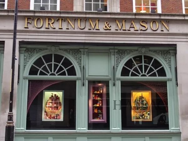
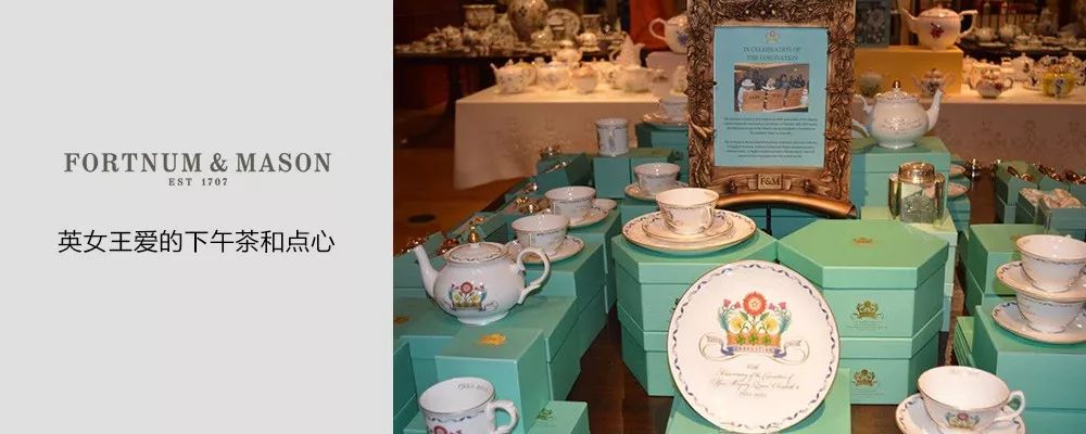
Yvonne Isherwood, product and packaging design manager at Fortnum and Mason, said: "Light green is a strong brand label - especially for consumers outside the UK, it's even more convincing than our name. "
"This is our best advertising tool and why we use it on product packaging such as plastic bags and gift boxes, but it's also important not to overuse it so as not to demean it or make customers weary of it." Eastwood added.
Laurie Pressman, vice president of the Pantone Color Institute, says that while color is only one aspect of a brand, its importance should not be overlooked because it has the ability to quickly disseminate brand messages and values.
"Today, color has become part of product design." "Companies need to make sure that all of their elements work in synergy and engage people, or they're going to pass consumers," Presman said. "
The influence of color on emotion and the power to arouse emotion can have a significant impact on buying behavior, but few marketing campaigns really make the most of it.
In a recent point-of-sale field experiment, carmaker Honda used Experience Insight, a specialist research tool in neuroscience, to compare the differences in sales data between normal showroom environments and custom "blue compartments."
Experiments have shown that blue walls can calm customers more, which means they are more likely to move the sales process forward with sales people in an easy way. Negotiated sales profits in the "blue compartment" are about 35% higher than in a normal showroom environment.
"I thought color wouldn't affect customer behavior, and the purpose of the experiment was to determine whether the environment, including color, would affect sales margins." Warwick Humphries, managing director of HSH Automotive Group, explains that he owns four Honda car sales stores.
"I didn't expect the results to be so positive, and color proved to be a very important part of the overall design strategy of the dealer environment."
But not all colors have the same effect. Google, which tested 41 colors on its search-box ad links before finalizing its current blue color, has generated an additional $200 million in advertising revenue for the company.
Other brands may not be as rigorously scientifically tested as Honda and Google, but they have also found the role of color in boosting sales and brand awareness.
At the end of last year, Carlsberg, the beer brand, rebrarded its Express sub-brand, highlighting its "Danish heritage", emphasizing the unique Danish culture of "hygge", advocating a gentle, unscathed, laid-back life that sought to balance "warmness" with "coolness".
Lynsey Woods, Carlsberg's marketing director, revealed: "We use white as the main colour of Express, which means 'cool', much like the reflective effects of using more white ceramics in Danish rooms, while the texture of copper releases 'warmth', a common colour in Danish households, inspired by the distillers used by Carlsberg Brewery to make beer. "
Carlsberg is working with professional design agency Taxi Studio to advance the project. Carlsberg's signature green bottle has been replaced by a brown bottle, a symbol of craft brewing and high quality, and is not easily lighted to avoid affecting the quality of the beer.
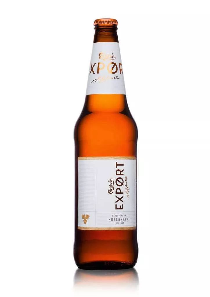
"Green is the mainstay of the 170-year-old Carlsberg brand, so Carlsberg needs a lot of determination to make that change," Woods admits. Export's market performance shows that innovation has paid off, and it really helps consumers re-evaluate the brand. "
After the rebranding, Carlsberg launched a massive consumer communications campaign and opened 10,000 new distribution points. In March-June 2017, its positive reviews on social media channels increased by 81% and sales at retail terminals increased by 10%.
Le Creuset, a well-known French culinary vessel brand, has been using colors since 1925 as part of its efforts to integrate the brand.
Now Le Creuset has expanded its original single tone to nearly 100 colors. The reason these colors are chosen is that they are aesthetic and can be separated from traditional cooking utensils.
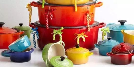
"The constant introduction of new colors creates a new sense of wonder." According to Ingrid Lung, senior brand manager at Le Creuset UK, "As the social environment changes and color trends continue to evolv, this innovation allows us to maintain the same pulse as consumers and meet the preferences of different markets and consumers." "
Le Creuset holds two events a year, one in spring and summer and the other in autumn and winter, to promote trends in color, materials, food and lifestyle. This helps brands to further use color, influence people's traditional color views, and improve the classics.
In the business world, carefully selected colors are undoubtedly a powerful means of boosting product sales, but also the achievement of Le Creuset "cookware LV" name.
"Color is an important force for a deep first impression." "There used to be only a three-second chance to get people's attention, and at the current fast pace, I think that's reduced to two seconds," Presman said. If you don't want to miss it in vain, you have to play the color card. "
-END-
This article is a new marketing editor.Do not reproduce without authorization.
Welcome to share, reprint please reply"Reprinted"Learn what to know.
Any exchange of ideas, welcome to the background message hook-up
The marketer's preferred media

Go to "Discovery" - "Take a look" browse "Friends are watching"