Still advertising at a big price? Store space is done well, is the best advertising!


The main role of advertising is to promote, deepen the customer's brand impression, attract and stimulate customers into the store consumption. Advertising, it is widely reported, needs to be spread, communication needs someone to spread.
(Exhibition of Republican products welcome to reproduce please indicate the source)
In fact, those who enter your shop customers are the best live advertising, people always like to share their own beautiful things to everyone, if the customer in a very pleasant environment shopping, he will not share this happy mood to everyone?
So what kind of stores are they willing to share and advertise? That's what The Republic is going to say to you today.
Experienced stores create a very pleasant shopping environment for customers, shopping in a pleasant shopping environment, but also enhance the customer's taste for the store/brand.
If you ask customers why some stores can let them rate so high, many people will explain that the store space planning is convenient to shop, products are easy to find, guide signs clear and accurate information or some intimate details can give customers a good shopping experience.
Are you guessing if The Republic is going to pull Ikea out again? (It is undeniable that IKEA's sense of experience is really very good, but the Republic Jun does not write it, lest you think that the Republic Jun is receiving IKEA's money.)
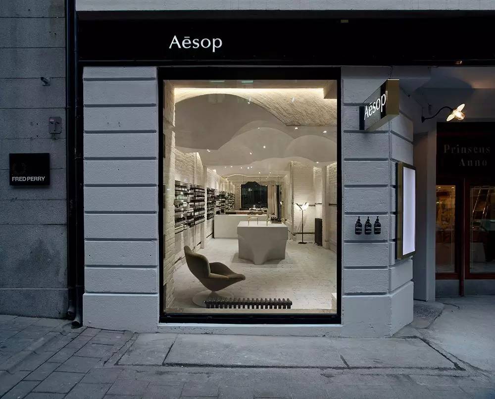
Today we don't talk about IKEA, to see a skincare-focused brand: Australian organic skincare brand Aesop to see how it conquers its customers with experience. (above for his store)
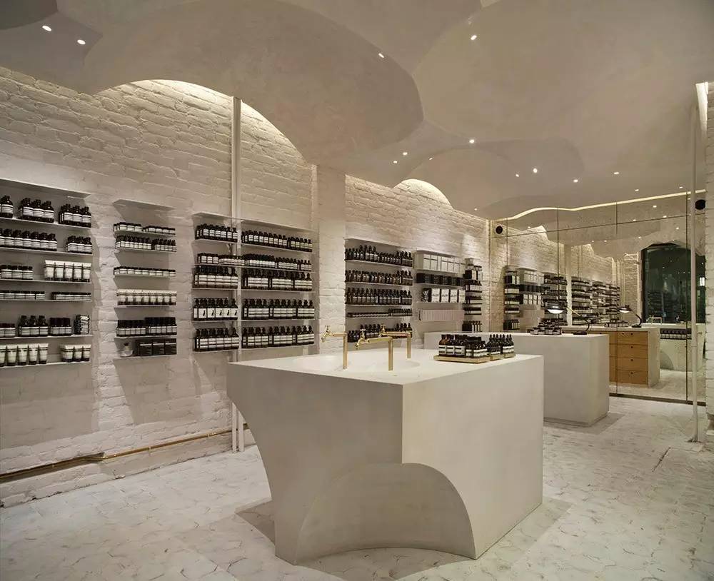
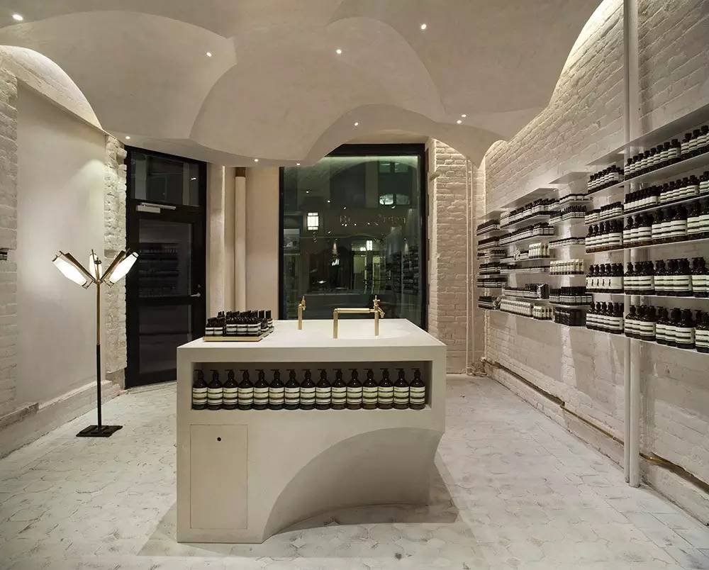
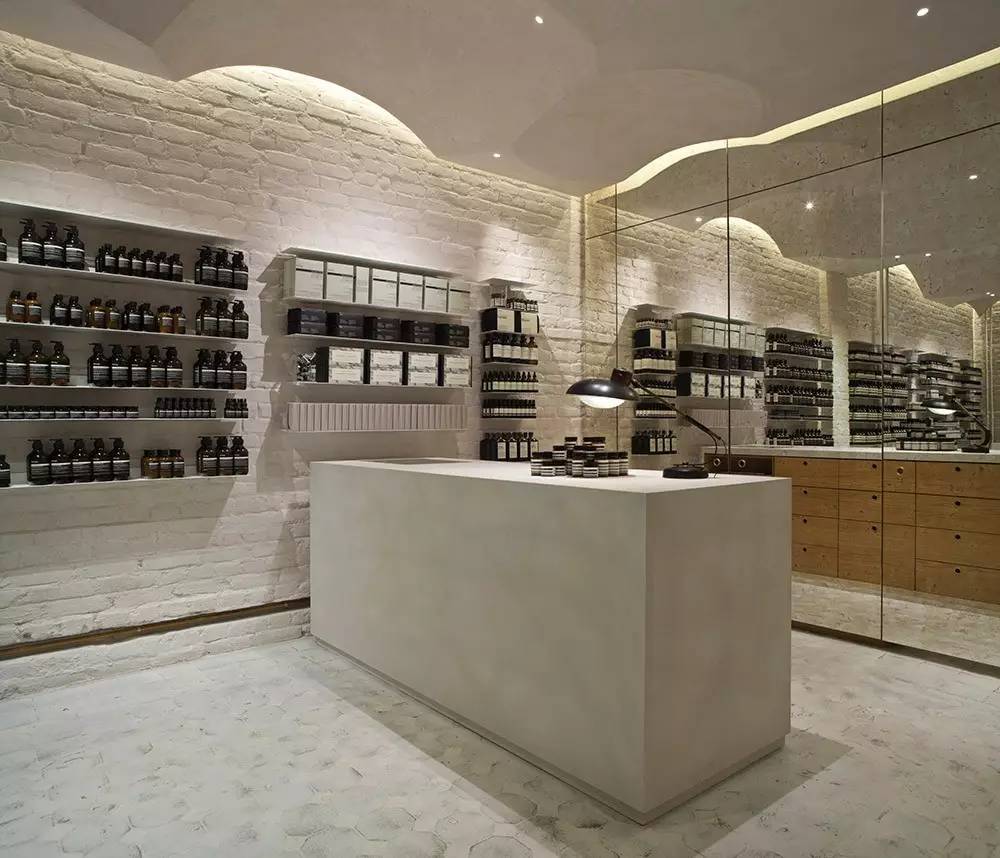
Hand washing table is the most experienced design of Aeso, but also the outstanding characteristics of Aeso shop, in all Aeso stores have such a customer experience product washbasit, a good use of user thinking, so that customers in the store can experience the effect of the product.
Products are available on the platform of the pool and on the floor below, so that customers can see other types of products during the trial, increasing the likely to buy.
The cash register has some small, fragmented bottles for customers to buy when they check out.
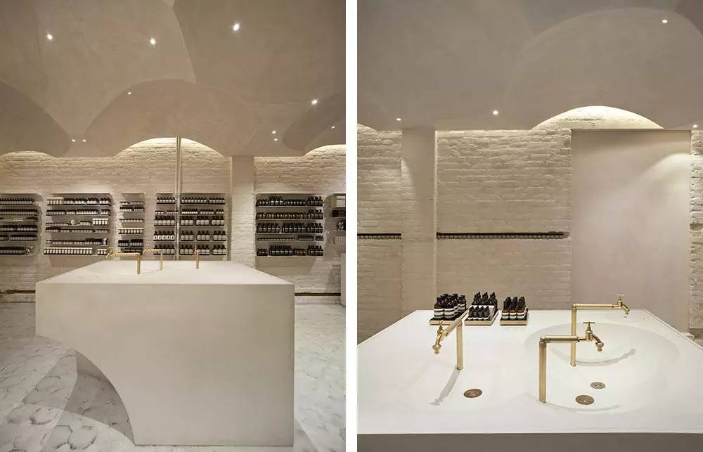
Multiple pools are designed to allow several customers to try out at the same time, avoiding waiting times in line.
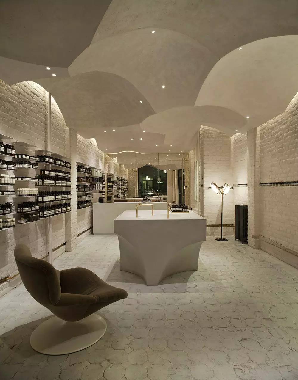
The design of the arc under the hand-washing table echoes the ceiling, and this design also allows customers to have a better experience when trying out the product, the knee part has more space, will not be at the hand-washing table.
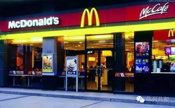
Let's start with a brand of ground gasMcDonald's, why is it easy to think of McDonald's when you see the "M" word or red and yellow color scheme? It's because its stores are using this "M" recurring and red-and-yellow colors to deepen your brand impression of the store.
After watching McDonald's, let's look at a sunglasses brand that we talked about before:Gentle Monster, which has a very strong brand impression, has a unique store theme in every store in his home.
This unique store style has made a very strong impression on the brand.
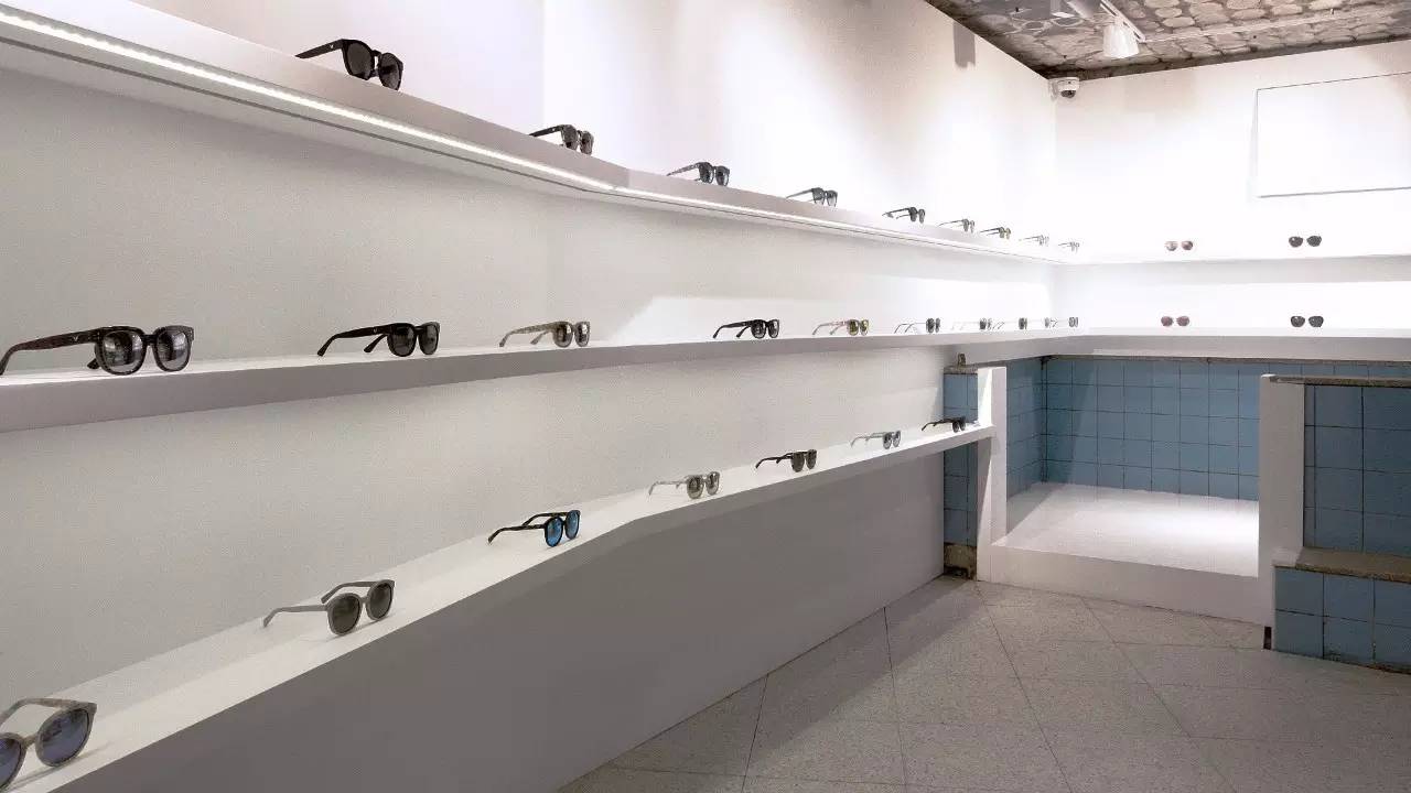
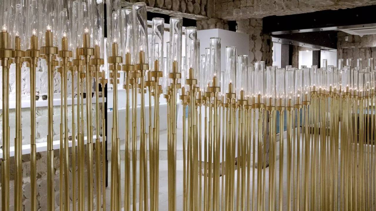
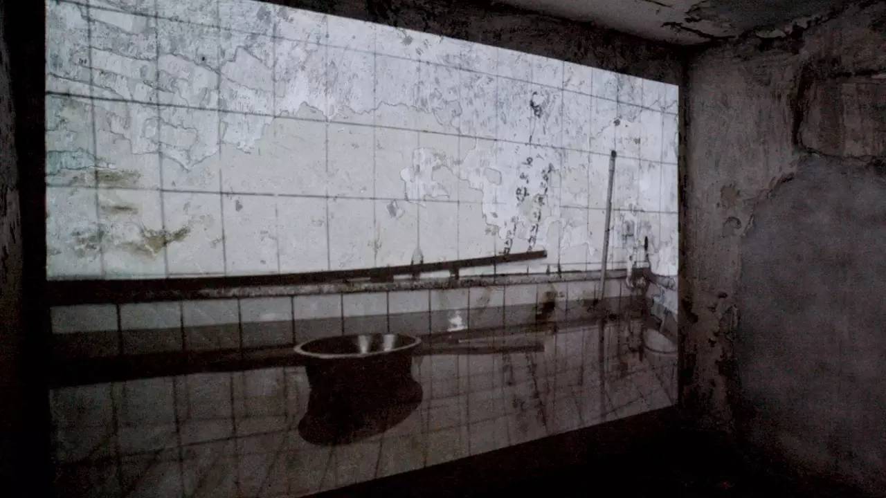
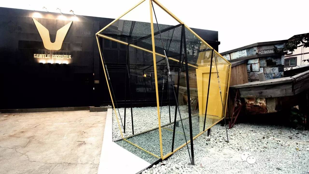
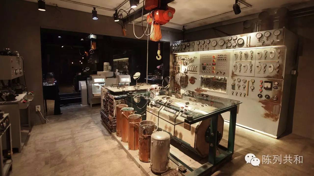
This.Gentle MonsterIt is a shop in Seoul that preserves the original equipment in the original mass bathhouse, incorporating the brand's mood and recreating the concept of "creation and preservation".
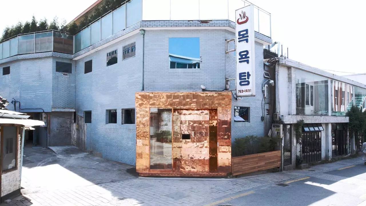
The original old house, coupled with a strong metal sense of the door head, the contrast between the two materials, very attractive.
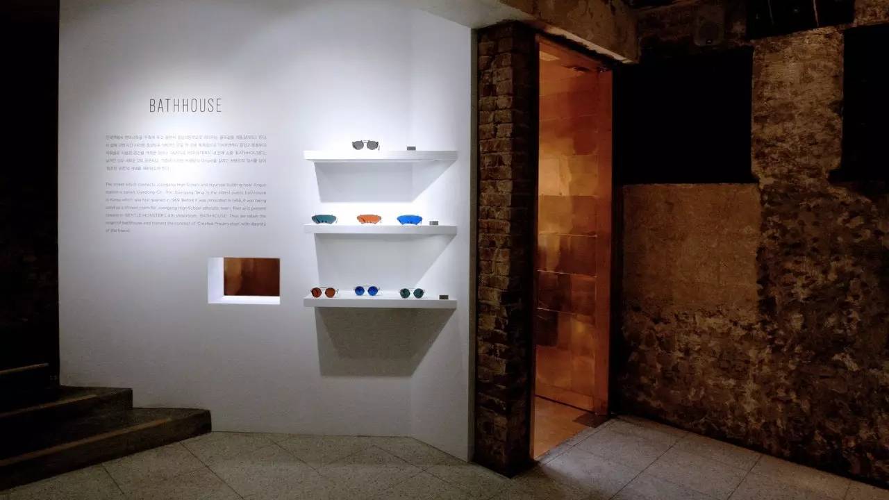
There is a description of this shop at the entrance, in factEvery store in Gentle Monster has its introduction or theme at the head of the store. A small exhibition area has also been set up next to the introduction, so that customers can also see the goods when they look at the introduction.
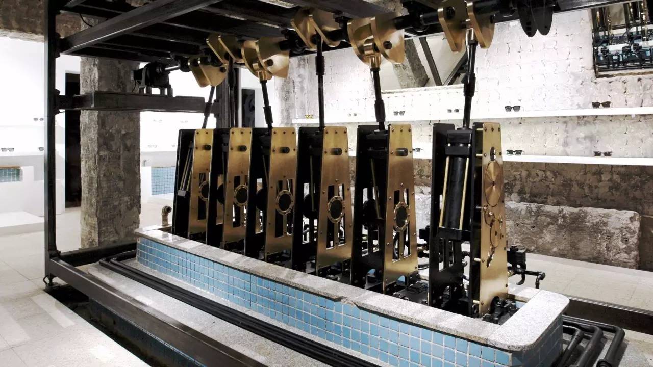
The old machine was not removed, but left in the shop as a good magnet point.
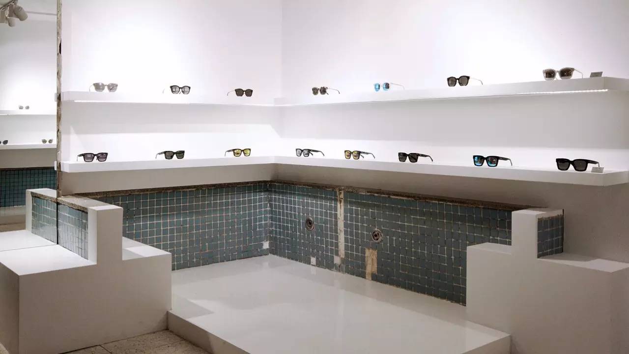
The old bath tiles blend with the white walls to create a different style.
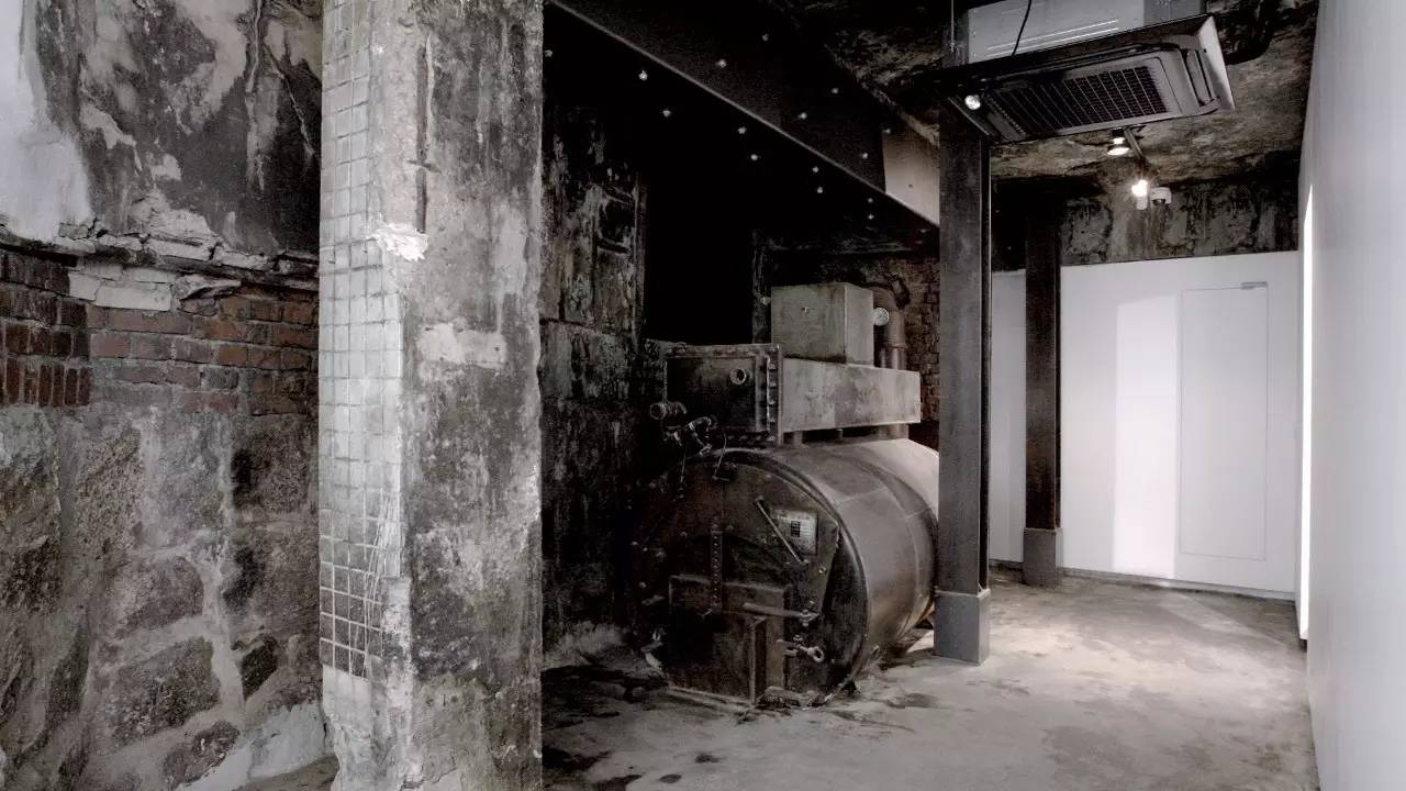
Unrecorded areas, to maintain this original state, but also highlighted the theme of the shop, the old things to keep down, into the brand, to form a new style.
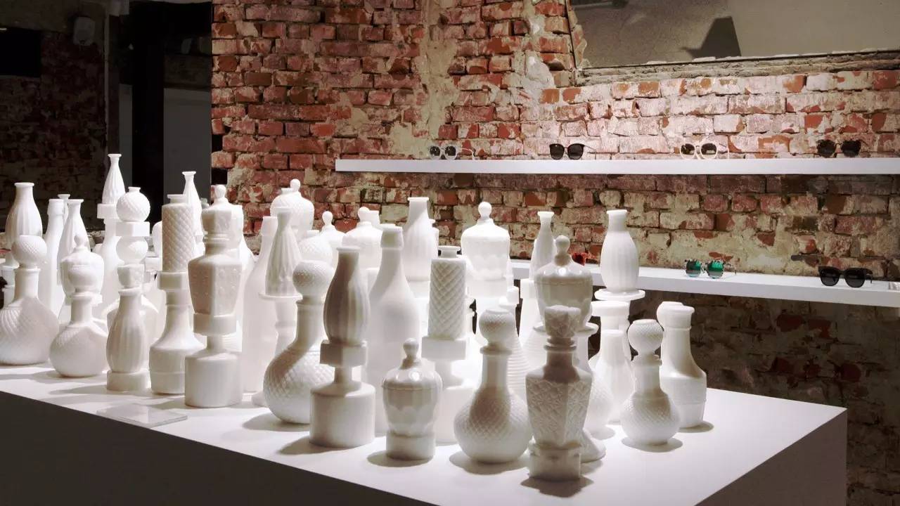
On one side is the white decoration of the wall, on the other side is the old red brick wall, the two styles collide in this space, let people have a very strong sense of vision.
This is.Gentle MonsterThe shop in Seoul's special Gangnam district, on the cave, is boat-themed, seeing a variety of different rooms by boat and creating an indelible journey for customers through stories from different rooms.
The yellow frame and transparent glass make up the head of the shop and the decaying old hull behind it, creating a strong contrast and curiosity that many customers want to go in and see.
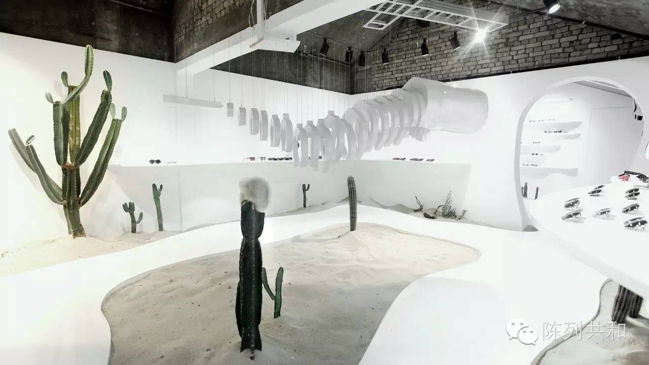
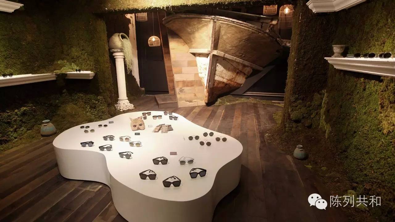
Moss-covered walls and exposed escape shipheads all make people feel like they're in a rotting boat, with a strong sense of insecoming.
Shopping in a shop like this, don't you shoot crazy? and upload it to a circle of friends?
Creative stores, always let customers surprise, in surprise and admiration, will be more firmly remember your store or brand.
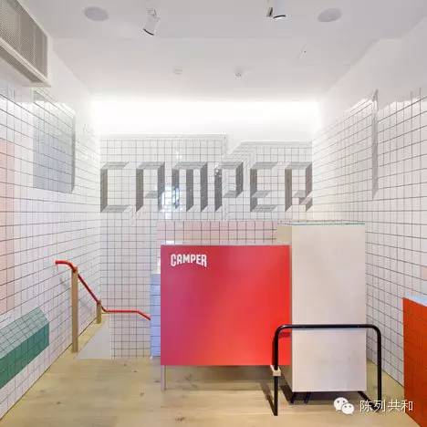
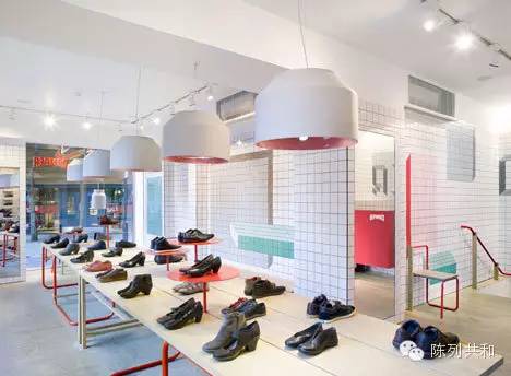
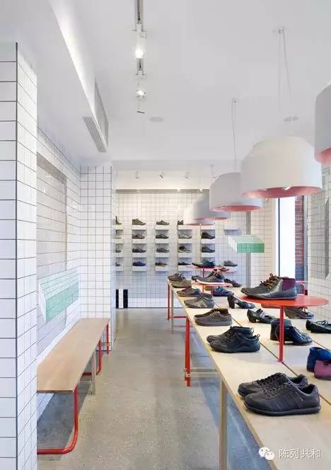
The name of the brand below is Camper, Chinese a look.
The visual marketing of his shop is really creative. Perhaps that's why it broke the billion-dollar mark in annual sales, which reached $120 million last year and sold more than 3 million pairs of shoes.
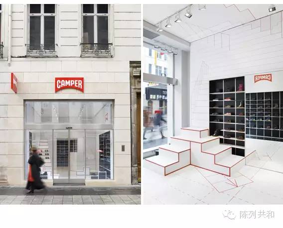
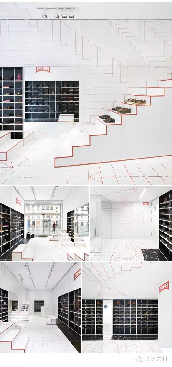
This is a step-by-step shop from France, the shop display and space design at the beginning of the embodiment of a "walking" element.
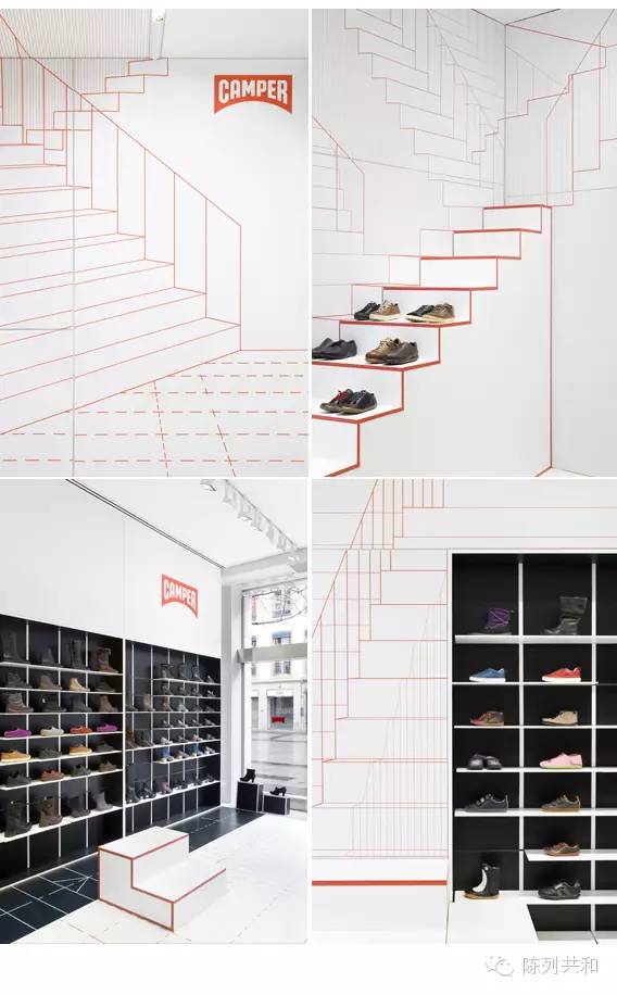
This element of the steps is to assist in the expression of the concept of "walking" exists, the shop as a whole to white as the main tone, the use of brightly colored lines to depict the outline is full of fun, but also make the shoes on display as if to walk down the stairs.
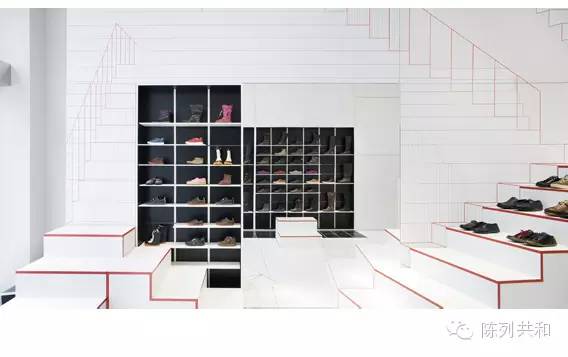
The inside of the shelf is gray-black, jumping out of the white main tone at once, attracting the eyes of consumers at a glance.
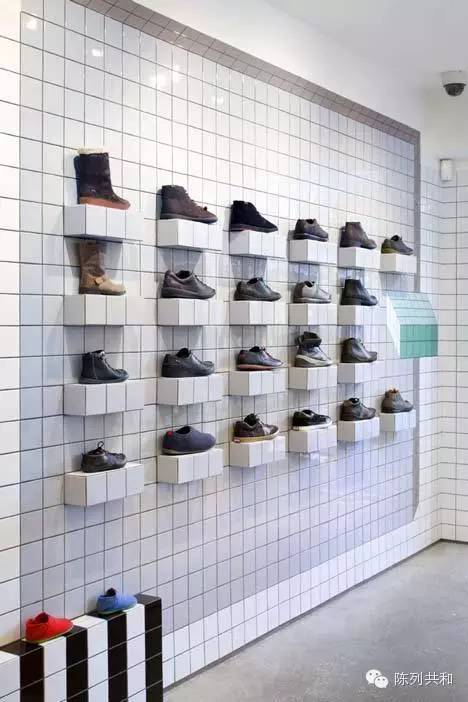
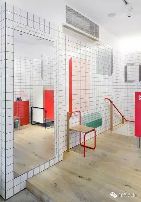
Its other store in London, very creative use of small squares this element of the store space design, they simply played the small squares, because they make the shop there are a lot of visual misal position, very interesting!
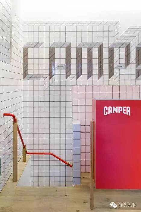
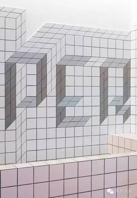
The tiles of small squares use visual illusions to combine into a seemingly three-dimensional brand LOGO.
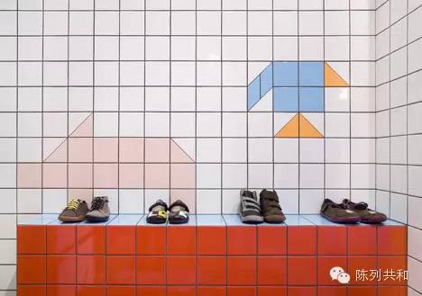
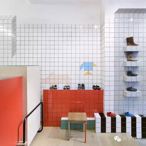
Small blocks of color appear unknittingly in the corner of the shop, making the space more vibrant.
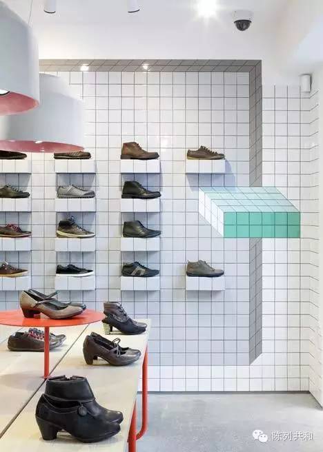

The use of tiles to create visual errors, people have a prominent three-dimensional sense.
After reading these three types of stores, if you meet them while shopping, can't you wait to share them with your friends?
So the space design of the shop must not be ignored, because it is the best advertisement in your shop!

Go to "Discovery" - "Take a look" browse "Friends are watching"